Political compass maker
This political compass maker gives you the empty quadrant chart to plot yourself: it is not the political compass test, and there is no questionnaire. You write the four pole labels, place people, characters or opinions in the quadrants as pictures or text, recolour the sectors, and export a political compass meme you can post.
Also known as: polcomp maker, political compass generator, political compass chart maker, political compass meme maker, quadrant chart maker, political spectrum chart.
Free. No account needed. Export a PNG.
Start a compass
Blank political compassOpen a blank political compass in the editor, or pick a category of community templates. This is the four-quadrant political compass format (and compass memes once you rename the poles), not a navigation rose or a spreadsheet gauge. Politics, characters, games, movies and TV, memes, and other each lead to the blank political compass hub.
Browse by category
Download a blank compass
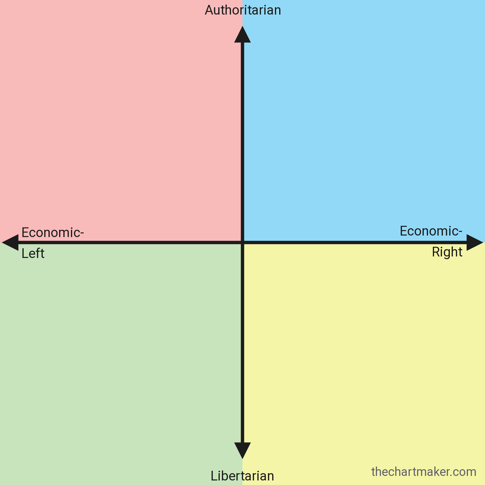
The empty chart as a picture, 1600 pixels square, with the four standard poles already labeled. Fill it in by hand in any app, or open the editor to place pictures and text on it here.
Popular political compass templates
See all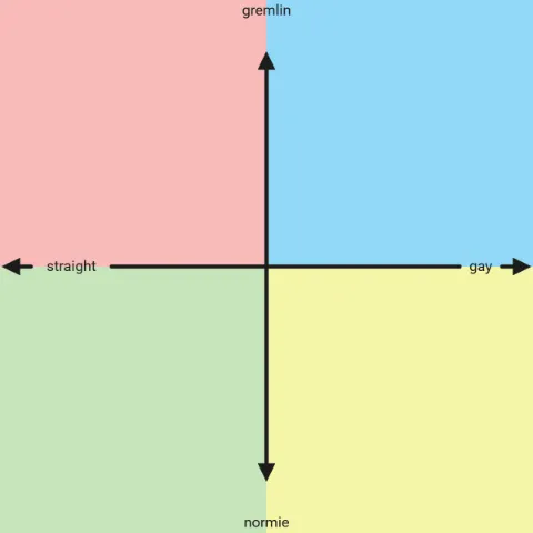
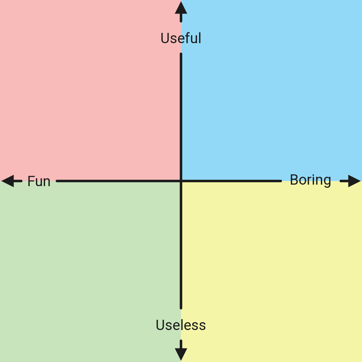
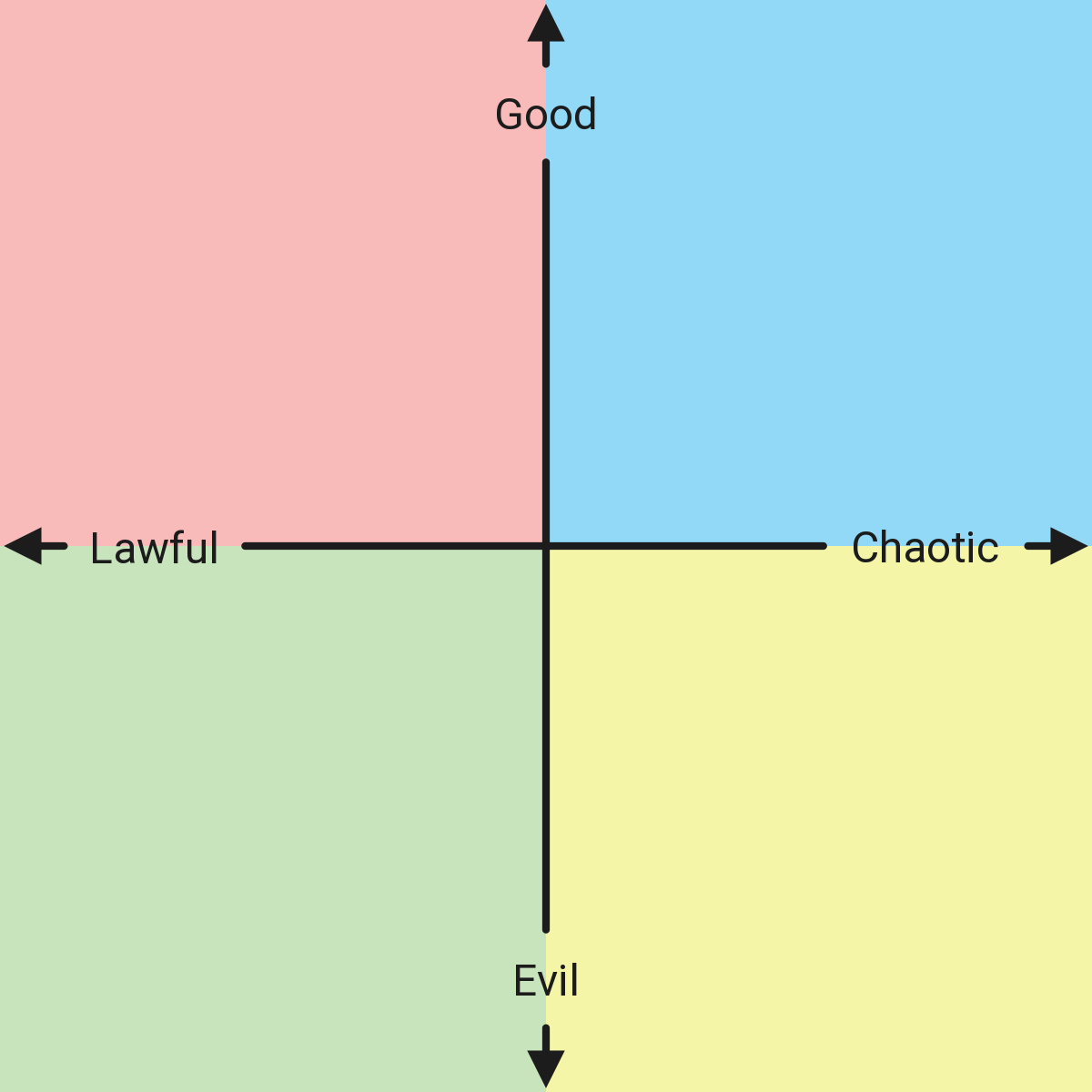
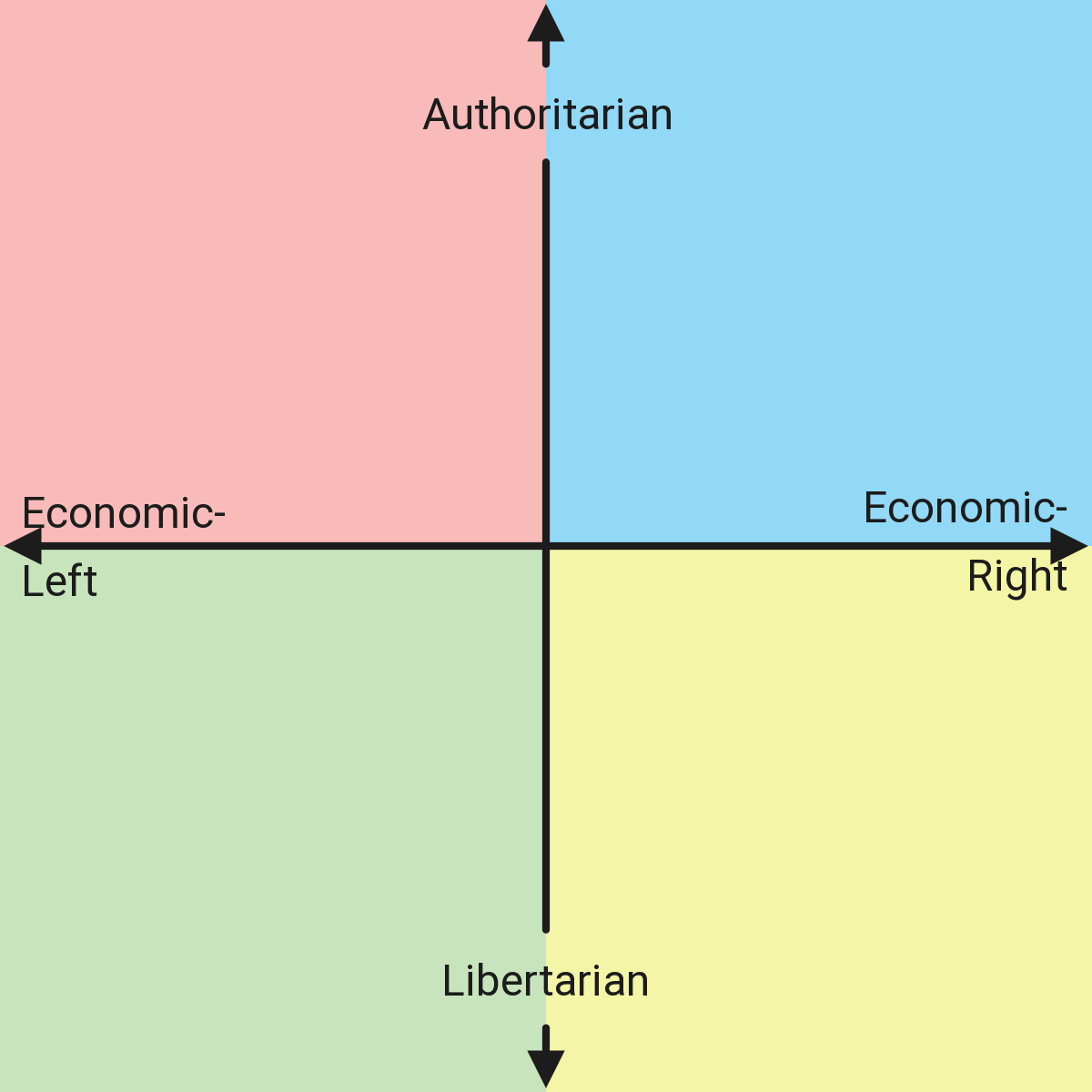
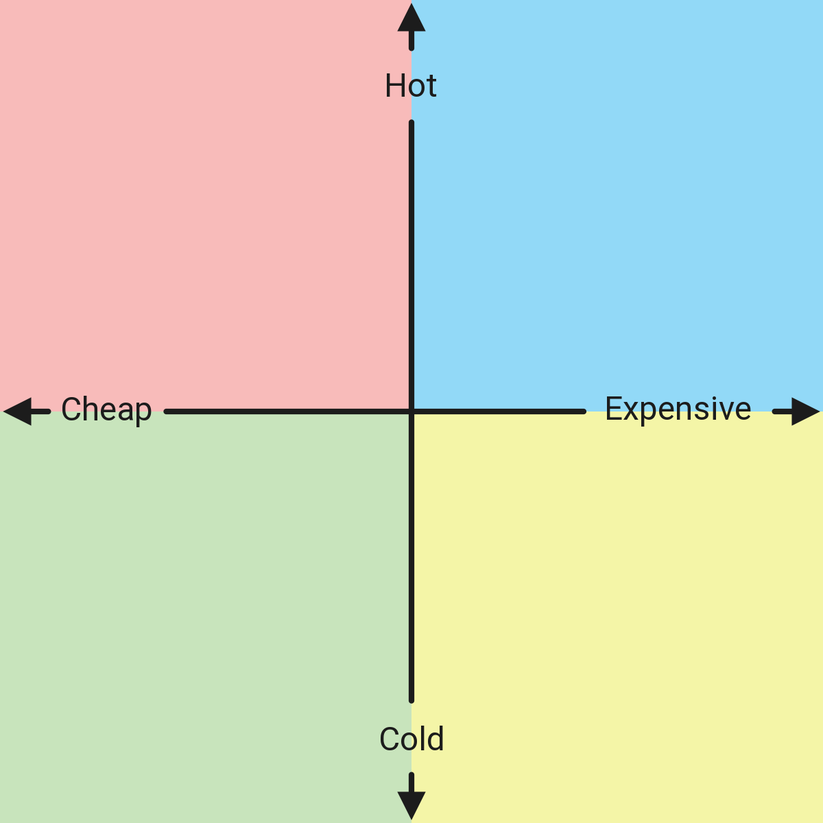
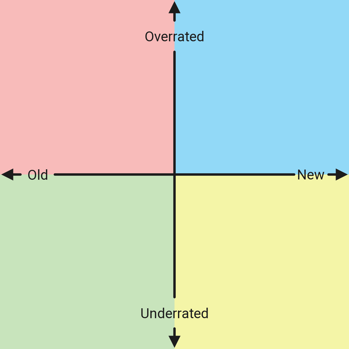
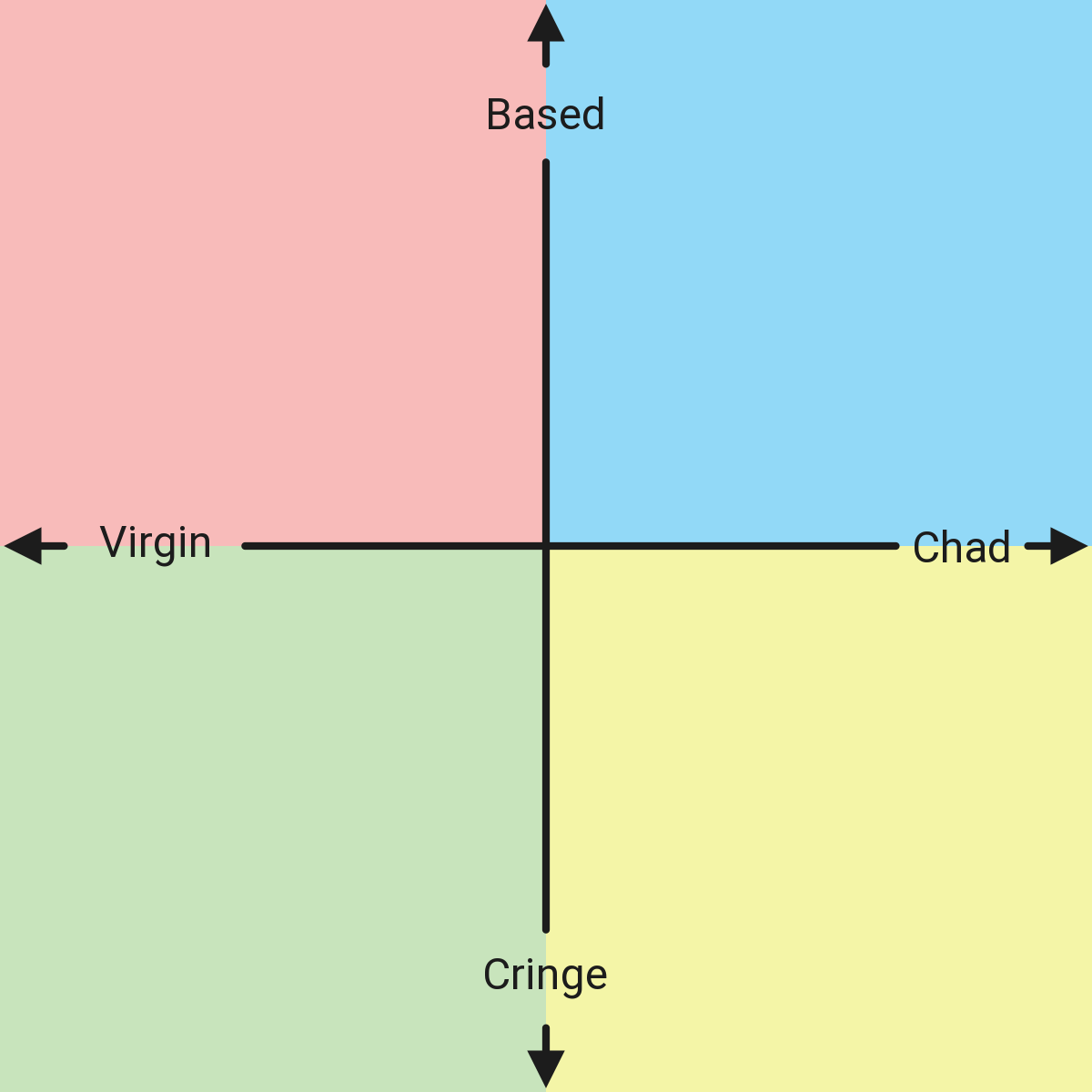
Popular completed compasses
See all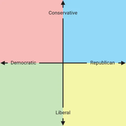
Compasses people are filling
There are no open compass fills yet.
How to make a political compass
- Name the four poles. The chart opens with the labels everyone recognises: authoritarian at the top, libertarian at the bottom, economic left and economic right on the sides. Click any label and type over it. If you are making a compass about films or snacks rather than politics, this is the only step that changes.
- Add whatever you are placing. Upload images, type text labels, or use both together so a face carries a name. Each item is a separate object you can move, resize, rotate and layer, and you can add shapes or a freehand scribble on top if a point needs circling.
- Drag everything into position. On a compass the position is the whole argument, so the placement is free: nothing snaps to a grid, nothing is locked inside a quadrant, and items can sit right on an axis when that is the honest answer. Zoom in for the crowded corner.
- Export or publish it. The export frames itself around what you placed, so the compass fills the picture with no dead space around it. Download a PNG for a post or a chat. Publishing is optional and gives you a link with a preview card plus a page other people can find and remix.
What you can do
- Two to eight axes, which is four, six, eight, ten, twelve, fourteen or sixteen sectors.
- Every pole label is editable text, not a fixed political word.
- Per-sector colours, from the pastel default to any colour you pick.
- Images, text, shapes and freehand drawings, placed anywhere on the chart.
- Free placement with no snapping, so a point can sit exactly where you mean it.
- An export that frames itself around what you placed, so the finished picture is the compass and nothing else.
- A political and quadrant compass you draw, not a navigation rose or a spreadsheet gauge.
- No sign up, no install, and nothing to pay.
- Drag, pinch and zoom on a phone as well as a desktop.
- PNG, JPEG or PDF download, plus a shareable page if you choose to publish.
Make your own political compass
Your group chat
The classic use. Everyone gets a photo and a spot, the axes are whatever the running joke is, and the argument that follows is the point. Because the labels are free text, the axes can be as specific as the people in the chat: two of them will demand a recount.
The cast of one show
Put every character on the same two axes and the comparison writes itself. Fandom compasses travel further than most charts because anyone who knows the show has an opinion about at least one placement, and the ones nobody agrees on end up in the replies.
Bands, films and games
Serious axes or silly ones: overrated to underrated, comfort to challenge, cheap to expensive. Cover art works well as the pin, since the picture is recognisable at a glance and you do not need a legend to explain what you are looking at.
Food and other low stakes nonsense
Sandwiches, cereals, crisps, fast food chains. A compass makes a good argument out of a subject with no stakes at all, which is exactly why these get shared. Two axes force a real answer in a way a plain ranked list never does.
Two axes that are not political
Nothing here is tied to politics. Rename the poles and the same chart becomes a quadrant chart for anything with two dimensions: effort against reward, risk against payoff, price against quality. The four coloured sectors keep the quadrants readable at thumbnail size.
An actual political take
It also does the plain job. Place parties, candidates, policies or historical figures on the standard four labels and leave them where you think they belong. This is a drawing tool, so the placements are yours: nothing is scored, weighted or calculated for you.
Common questions
Is this the political compass test?
No. There is no quiz here and nothing works out your position for you. This is the blank chart and the drawing tools that go with it, so you decide what each axis means and where every point sits. The test is a questionnaire that gives one person one dot; this makes the picture with everyone on it, which is why the two get confused. If you came looking for the questionnaire, this is not it.
How many axes can I have?
Two by default, which gives the familiar four quadrants, and up to eight. Each axis draws two opposite arrows, so eight axes gives sixteen labelled sectors around the centre. Every sector keeps its own colour and its own label, and you can change the axis count after you have started without losing what you placed.
Can I use pictures instead of dots?
Yes, and most compasses do. Upload photos, screenshots, cover art or reaction images and drag them where they belong; each one resizes, rotates and layers independently. You can mix pictures and plain text on the same chart, which is useful when some entries have a recognisable face and some do not. The same drag, pinch-zoom and tap-to-select work on a phone.
Can I change the labels to something that is not political?
Yes. All four pole labels are ordinary text and you can replace them with anything: overrated and underrated, cheap and expensive, chaotic and organised. The chart does not know or care what the axes mean, so it works as a general quadrant chart just as well.
Do I need an account?
Not to make one. The editor opens straight away, your work is kept in this browser as you go, and the export never asks you to sign in. Publishing is the one action that needs an account, because a published compass is a public page with a name on it. Signing in at that point also collects your published compasses on one profile page and lets you keep editing them from another device.
Is there a watermark on the image?
The downloaded image carries the site address, tiermaps.com, in small type in the bottom corner of the picture. Nothing is drawn across the chart itself, and the preview image on a published page carries no mark at all. That is the whole of it: no logo over the middle, no upgrade prompt, no cropped export.
Can I start from a blank compass?
Yes, that is the default state: an empty political compass with the four standard labels and nothing placed on it. Create opens that blank chart in the editor. The blank political compass page, linked from this maker, is the template hub: categorized community templates plus the empty four-quadrant chart for anyone who wants to fill a template in rather than start from scratch.
Is this a navigation compass or a spreadsheet chart?
No. This is the political and quadrant compass: two axes crossed into four coloured sectors, with pictures or text placed wherever you think they belong. It does not draw a nautical rose, a polar plot or a gauge. The same editor also makes compass memes once you rename the poles.